 On March 8th, after nearly five hours of viewing, I exited the new Whitney Biennial thinking, what went wrong? Did the curators run out of time? Was there a shortage of money for travel and planning? Did they have to cover too many bases themselves, for lack of staff support? After selecting the artists, did they fail to provide feedback on the artists’ plans? Did their aesthetic and political biases channel them toward juiceless, schematic, half-baked work?
Most of the exhibition is inert, at least for me. Most of it just sits there, evoking zero molecular exchange. It doesn’t help that the show is so crowded. Or that the layout presents so much work in corridor-like spaces. Or that traffic flow for the video rooms creates a distracting bustle at those doorways.
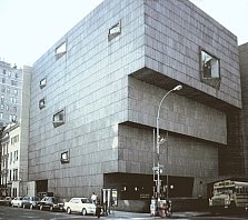
Or that the show takes place in the Whitney’s Breuer building, which has aged badly. From down the street, the building still looks iconic. Close up, it is a dreary place with a pathetic entrance, a cheesy Sixties lobby, and grim stairwells. The galleries seem to bear no relation to the building’s shell. The place is shabby around the edges, as if the maintenance budget had shrunk due to inflation. (The men’s room on the restaurant level looked like something from a Trailways depot.)
But I digress. The building is a separate issue. I’ve seen better shows in worse buildings. I cannot fathom why the curators came up short. There is no shortage of good artists. There is no shortage of artists willing to work insane hours to put a show together.
Perhaps there were warning signs. For the first time, the Biennial was given a title. The curators chose “Day for Night,” borrowed from the English title for Truffaut’s film “La nuit Americain.” (Day-for-night refers to techniques for shooting night scenes in daylight.) The film is largely a comedy about movie-making, but as used in the Biennial, the title is supposed to register as sinister. And clever — don’t forget clever. It refers to the queasy feel of reality in the Bush era and the dark zeitgeist fostered by the Bush Administration and by American culture in general. But the title doesn’t illuminate the show, or unify it. It's just marketing.
Another warning sign: the fictive 3rd curator created by the two actual curators. The less said, the better.
For irony lovers, the exhibition comes with embedded darkness of its own: the lead sponsor is the Altria Group, formerly known as Philip Morris.

No comments:
Post a Comment