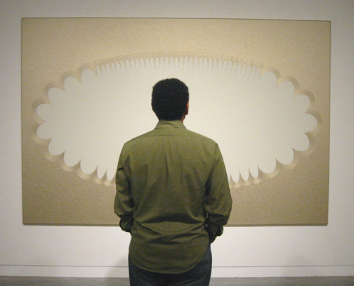
 Patricia Sweetow Gallery is presenting new paintings by mid-career British artist Jane Harris. The largest of these is pictured above. People are dazzled by the technical virtuosity of this work, but though I admire it, that’s not exactly what interests me.
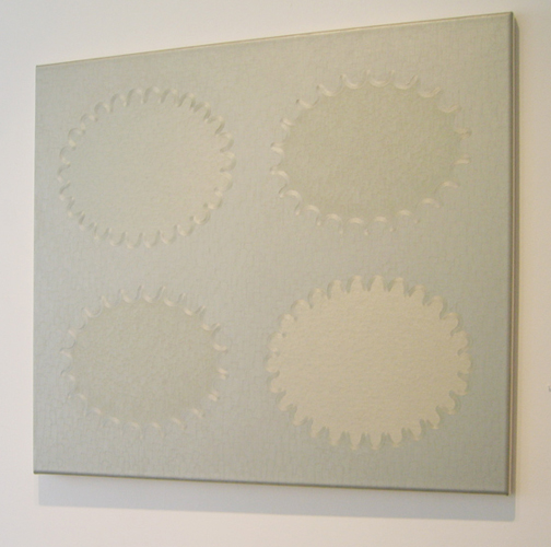 Certainly the skill is remarkable. The surfaces are silky—note the image above, adapted from the gallery website. The hand control at the borders of the abstract shapes is fairly amazing (see detail below). You find yourself looking close to understand how what you see could possibly be done. As explained by the artist, the work is developed through a lengthy process of small drawings, large drawings, multiple layers of oil paint, and marathon sessions in which entire layers of these sizable canvases are worked in wet paint.
 In addition to the suave brushwork, there are optical effects that capture the attention of viewers. Sometimes the metallic paint is brushed in different directions to create light refractions that shift as you move back and forth. Sometimes there are spatial effects: as you stare at the paintings, the shapes can pop into 3D and return to flatness. Also there is a slightly sculptural feel to the canvases themselves, resulting from the use of rounded stretcher bars. But, again, for me the core of the work lies elsewhere.
One essential element is the approach to color, so restricted and specific. Earlier paintings by Harris used saturated Pop colors, and those were persuasive. The new palette is quite different, metallic tones next to creamy tones. The effects are riveting. (Below is a painting in which the dominant color is copper.)
 In addition to the color choices, what interests me most is the work's internal tensions and a certain obdurate quality. There is a tension between mechanical precision and a hand-made look. There is an argument between the somewhat goofy abstract shapes and a Minimalist severity. There are spiky, nervous shapes along the contours of the abstract shapes. There is opposition between a restrained taste and over-the-top luxury. (I thought of a satin headboard in a 1930s film starring Jean Harlow.) There is a marked tension between lushness and blankness.
It is the blankness, oddly, that seems to give a backbone to Harris's work. While not classically Minimalist, the work gains strength from its refusals. The paintings look all dressed up with nowhere to go. Their primary forms—elliptical shapes whose contours are smaller ellipses fanning outward, set off by frilly or nubby scrolled borders—look like containers for things that have vanished, or never arrived. Perhaps an embossed area at the top of fancy stationery, but without a printed name. Or a cartoon thought bubble without a thought. Or a cartouche devoid of text or figure. Or an advertising graphic without its slogan or logo.
What you see is not a neutral blankness. There is a sense of absence, as when one has trouble recalling a person’s name. There is an uneasy sense of vacancy. The lush technique is misleading. The work is seductive but unyielding.
There is something sly in the way Harris's work underlines the emptiness of formalism. You might say the work represents empty formalism without succumbing to it. The result is an eccentric style of abstraction that, with its high tensile strength, would hold up well in museums.

No comments:
Post a Comment