The cover of the December issue of Vanity Fair proclaims in large type that it's “The Art Issue.” Since the word “art” is placed right on top of Brad Pitt's crotch, you know they're not really going to talk about art. The real themes are put forth in a section of interviews called “Money on the Wall.” Here are some extracts from these interviews, which were conducted by Ingrid Sischy.
Tobias Meyer
(Worldwide head of contemporary art at Sotheby’s in New York.)
Freakonomics: “Why is it that a Rothko and a Park Avenue apartment are almost always priced the same? Now a great apartment in New York is $30 million, and now a great Rothko is also $30 million.”
On auctions as an alternative to dealers: “…access in the contemporary-art world is...about friendship with the dealer who will give you access and let you become one of the 200 people who are waiting to buy one of these artists….But an auction is meritocratic. The one that has the most money will walk away with the desirable object that they couldn’t buy at the gallery because the gallery doesn’t know them. That’s why the auction process is so successful….”
A key reason for owing art: “The material, repeated presence of a work of art does something very different than just looking at it. Every work of art has an aura, and you can’t really experience this if you don’t have it close to you.”
On art and social critique: “Artists today don’t have any intention of reforming the bourgeoisie. They’re actually happy with it.”
Jeffrey Deitch
(High-profile art dealer in New York.)
On the attraction of the art world: “It’s social in that you see all the action around the auctions, the art fairs, the parties that go on after them. People enjoy being part of this world. It’s fun. It’s sexy. It’s a way that the hedge-fund guys can really enjoy themselves….”
On what people are buying: “People want sexy images.”
Noticing an indicator of speculation: “Now, most of the people buying really like the art. But a lot of art is also being bought and going directly to the warehouse. That is a danger sign.”
On the art market: “I think that the art market is going to be increasingly like other financial markets now that people treat it like a financial market.”
Francesco Vezzoli
(Artist based in Milan.)
On his experience at art fairs: “…I feel raped. I can be a slut, but afterwards I feel raped. It’s violent. It’s the artists deprived of any context. It’s fast food.”
Ingvild Goetz
(Art collector based in Munich.)
On the quality of art being sold: “The problem is that there is so much bad art on the market. I would say there’s very little that’s great. I would say 80 percent is not.”
‘Nice’ doesn't cut it: “…there is a lot of nice art around. I don’t like to collect nice art.”
On the worth of art: “I said, ‘Isn’t it crazy? They paid as much for a van Gogh as they would for a big plane, like a Boeing.’ He replied, ‘If you could choose the van Gogh, how could you think it has the same value as a plane. The van Gogh is worth so much more than a plane.’ ”
Tuesday, November 28, 2006
Wednesday, November 22, 2006
Gay Outlaw & Dean Smith @ Paule Anglim
Alert: This exhibition is scheduled to close on 12/16/06.
In the current show at Gallery Paule Anglim, an apt pairing of artists creates a welcome interplay between the back and front gallery spaces. Though practicing in different media, the artists share an interest in abstraction, repetitive forms, precise craft, and the strategy of a restricted palette.
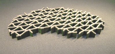
Gay Outlaw (her real name) is a sculptor who likes the floor, so it is a shame that the floor in this case is covered with aged gray industrial carpet. Her work seems uneasy on this background. Among the floor pieces, my favorite is a wavy lattice, about 6 feet long, that resembles a CAD 3D drawing. The material is wool felt in colors of cream and dark green (photo below).
Another floor piece, made of glass, also uses wave forms and the color green (photo below). This size of this work is described as “variable,”and it might look better in a layout different than five-by-ten, as used here. But that aside, I sense the piece is too small for its own good.
Moving off the floor, Outlaw has placed a fine “Cube Study with Shadow” on a shelf (photo below). The piece is 14" wide. An interesting feature of this work is the use of milk paint for the shadow. It's an old-fashioned, eco-friendly type of paint.
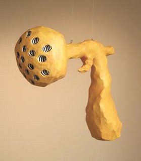
Even further from the floor, indeed hanging from the ceiling, is Outlaw's de-masculinized “re-do” of a 1959 sculpture by Claes Oldenburg, depicting a ray gun. Her version, about 30" tall, is pictured at the top (image from gallery website). The original, about 45" tall, is shown below (image from MOMA website).
The show also includes a selection of Outlaw's photocollages. These are respectable but hardly on the level of her sculpture.
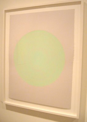
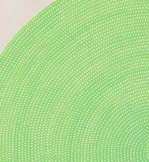
In the back room, Dean Smith holds his own with a varied set of drawings on paper. One of them sports a big fluorescent green disk that is built from a latticework like Outlaw’s felt sculpture. The second photo below shows the detail. Since much of the impact of this work derives from its luminescence, I wondered how soon the ink would fade. It seems a valid concern for a drawing priced at $6,900. (But it sold.)
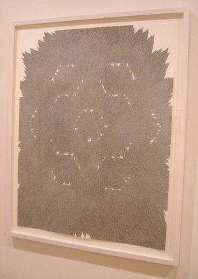
Along with brightly colored works, there are also several of Smith’s signature graphite drawings, including "focusing #2" (photo below, followed by a detail).
The exhibition seems a bit detached from the aesthetic rambunctiousness of the current art scene. But sometimes it’s good to have a calm moment.
Sunday, November 19, 2006
Blog Format Changes
I have migrated Art Fever to the new version of Blogger. I might make some minor adjustments to the format in the coming days.
A glitch caused by this migration is that subscribers to the Atom feed will find the entire set of recent postings showing up again as new items. This should happen only once. Let me know if you encounter any other problems with the site feed.
Saturday, November 18, 2006
3,480 Seconds @ Root Division (SF)
Alert: This exhibit is scheduled to close on 11/21/06.
Root Division’s warehouse-like exhibition space has been given over to a show of videos by 15 artists. The curator, Pablo Guardiola, calls it “More or Less 3,480 Seconds.” Because the monitors are spread around, and each has a handy volume control on front, a visitor can control the babel in order to focus on individual pieces. There is much to enjoy.
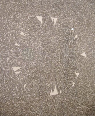
Making photos of video screens is a fool’s errand, but I have included several attempts in the spirit of better-than-nothing. I have also been able to borrow 4 good stills from the curator (including the image at the top).
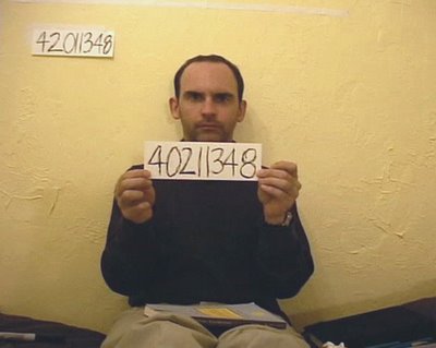
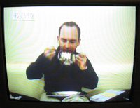
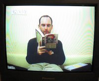
In James Tantum's video “My Memory Test,” he writes an 8-digit number on a piece of paper, sticks the paper on the wall behind him, and then proceeds in accelerated motion to eat and read, glancing at his watch periodically. (See photos below.) Finally he pulls out another piece of paper, writes the number from memory and shows it to the camera (photo at top). This finale is better than perfection would have been.
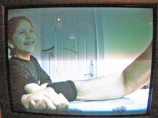
A video by Englebert Holder gives a new twist to arm-wrestling. Men and women, adults and children—even a baby—are defeated in quick encounters with The Arm. (Photos below.) Everyone smiles except the dazed baby.
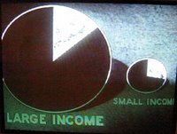
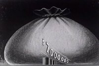
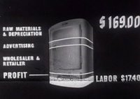
In “So Goes the Nation,” Roger Ngim offers a montage of clips from old informational films, backed by a romantic score (Tchaikovsky). The clips look like they could have been produced by the Department of Commerce in the 1950s. Samples are shown below.
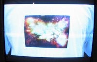
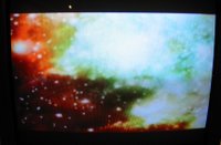
Some pieces use simple ideas to good effect. In “From Here to Eternity” by Paul Zografakis, a guy walks toward the camera until the image on his T-shirt—a nebula— fills the screen. (See two shots below.)
In another simple work (untitled), Brian Wasson turns his camera on a household space that has a pendulum clock in the background. The camera moves back and forth slightly, following the pendulum. You’ll laugh, I guarantee it.
Carlos Ruiz-Valarino’s “Hosts and Guests” uses sophisticated techniques to create a mystery. You see people gathering along a horizon line under a big sky as daylight fades. They could be arriving at a vantage point for watching an eclipse. As each group arrives, they are freeze-framed while new arrivals move across the terrain. One by one, select individuals are highlighted by a white circle that tracks their arrival across the screen. (Detail photo below.) There is a soundtrack that sounds like distant screaming and yelling.
Another inclusion is a reprise of Tim Sullivan’s “Magic Carpet,” already seen in other local shows. Sullivan and a companion appear to fly over San Francisco in a comically unsteady cart that looks like Santa’s sled.
Finally, for lovers of abject art, there is a sequence of cheesy puppet videos by Haden Nichols, full of smart-ass dialogue. This could be outtake art (photo below).
Internet Video at Mission 17 (SF)
Alert: This exhibition is scheduled to close on 11/18/06.
The current exhibit at Mission 17 (closing today) is a selection of amateur internet videos, curated by Clark Buckner. It’s a doubtful premise, since thousands and thousands of such videos are available to anyone with a computer, 24 by 7.
But context changes things. My viewing of this show re-framed what I already knew about internet video. It made me realize how much of it falls into the category of body art. Pioneers of this type of art—such as Bruce Nauman, Vito Acconci, Chris Burden, and Marina Abramovic—have been succeeded on the internet by non-artists, first as a trickle and now a flood.
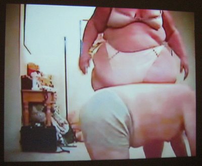
One clip from the show (photo above) reveals possibly the world's fattest dominatrix in a horsie scene with a man. One of her gambits is to lift her huge floppy belly with both hands and drop it onto the man's back. I have seen a lot, but I had not seen this before.
Thursday, November 16, 2006
Masako Inaoka at Blankspace (Oakland)
Alert: This exhibit is scheduled to close on 11/19/06 (Sunday).
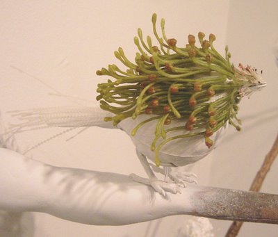
Misako Inaoka is fascinated by real-world mash-ups such as cell phone towers shaped like trees. (Examples of these can be found on the Larson Utility website.) In her solo exhibit at Blankspace in Oakland, this San Francisco artist has created her own mash-ups, blending the real with the artificial, the animate with the inanimate, and plant life with animal life.
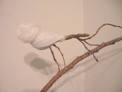
Using toy birds as armatures, she fashions surreal birds. (See the examples at the top and below.) Using a variety of other materials, she develops little ecosystems teeming with odd creatures. Some of the creatures are elegant, some impish. A few exhibit motion and sound. Most are creepy—in a droll way.
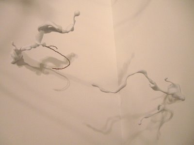
The birds sit among branches that are part real, part plaster. The branches can look like tossed milk (see photo below).
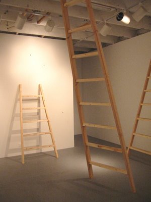
Inaoka has installed ladders (photo below) that lead to infestations near the ceiling. In the back wall, she has placed peepholes to give tiny views of additional creatures.
The details are entertaining, but in some ways the exhibit’s most impressive quality is Inaoka’s superb sense of placement. This is hard to experience in photos, as it is a matter of asymmetrical but precise balances throughout a complex installation. Viewing this show, it is not hard to imagine that this artist could go into any space, even a storeroom, and rearrange objects in a way that unifies the space while opening it up.
Saturday, November 11, 2006
Stephen Giannetti at Heather Marx (SF)
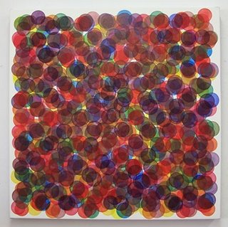
Stephen Giannetti produces a handful of new paintings each year. Using oil paint thinned until it is translucent, he covers a canvas (French polyester) with a tight pattern of small discs painted free-hand. Subsequently he adds another layer of discs and continues the process until there are six layers. Each painting uses a restricted set of colors that are deployed according to a pre-determined schema. On each layer, the pattern of discs is different. This creates overlaps, and because of the translucent paint, the overlaps generate additional colors. The result is a colorfield that appears to hover in space. The optical buzz may bring to mind the Sixties, but these paintings don't have the hard-edged aggression of Op-Art or the disorienting morphs of psychedelia. They are formal but buoyant.
Giannetti has worked most often in a square format, but there are a couple of rectangular pieces in his new show at Heather Marx Gallery. One tall piece looks like a doorway into controlled atomic fission. The photo below gives some idea of the work’s contained energy.
Perhaps my favorite in this show is a smaller work that has the effect of a mirage even though its colors are quite chewy (photo at top, from the gallery website).
It should be noted that photographs don’t capture the optical depth or the precise color effects of these works. They need to be seen in person.
Friday, November 10, 2006
Jane Harris at Patricia Sweetow (SF)
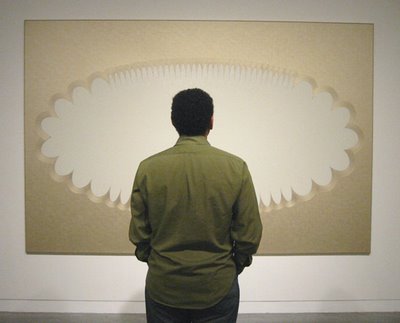
Patricia Sweetow Gallery is presenting new paintings by mid-career British artist Jane Harris. The largest of these is pictured above. People are dazzled by the technical virtuosity of this work, but though I admire it, that’s not exactly what interests me.
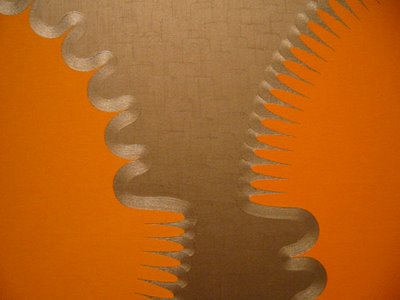
Certainly the skill is remarkable. The surfaces are silky—note the image above, adapted from the gallery website. The hand control at the borders of the abstract shapes is fairly amazing (see detail below). You find yourself looking close to understand how what you see could possibly be done. As explained by the artist, the work is developed through a lengthy process of small drawings, large drawings, multiple layers of oil paint, and marathon sessions in which entire layers of these sizable canvases are worked in wet paint.
In addition to the suave brushwork, there are optical effects that capture the attention of viewers. Sometimes the metallic paint is brushed in different directions to create light refractions that shift as you move back and forth. Sometimes there are spatial effects: as you stare at the paintings, the shapes can pop into 3D and return to flatness. Also there is a slightly sculptural feel to the canvases themselves, resulting from the use of rounded stretcher bars. But, again, for me the core of the work lies elsewhere.
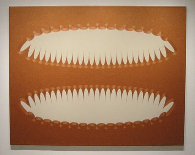
One essential element is the approach to color, so restricted and specific. Earlier paintings by Harris used saturated Pop colors, and those were persuasive. The new palette is quite different, metallic tones next to creamy tones. The effects are riveting. (Below is a painting in which the dominant color is copper.)
In addition to the color choices, what interests me most is the work's internal tensions and a certain obdurate quality. There is a tension between mechanical precision and a hand-made look. There is an argument between the somewhat goofy abstract shapes and a Minimalist severity. There are spiky, nervous shapes along the contours of the abstract shapes. There is opposition between a restrained taste and over-the-top luxury. (I thought of a satin headboard in a 1930s film starring Jean Harlow.) There is a marked tension between lushness and blankness.
It is the blankness, oddly, that seems to give a backbone to Harris's work. While not classically Minimalist, the work gains strength from its refusals. The paintings look all dressed up with nowhere to go. Their primary forms—elliptical shapes whose contours are smaller ellipses fanning outward, set off by frilly or nubby scrolled borders—look like containers for things that have vanished, or never arrived. Perhaps an embossed area at the top of fancy stationery, but without a printed name. Or a cartoon thought bubble without a thought. Or a cartouche devoid of text or figure. Or an advertising graphic without its slogan or logo.
What you see is not a neutral blankness. There is a sense of absence, as when one has trouble recalling a person’s name. There is an uneasy sense of vacancy. The lush technique is misleading. The work is seductive but unyielding.
There is something sly in the way Harris's work underlines the emptiness of formalism. You might say the work represents empty formalism without succumbing to it. The result is an eccentric style of abstraction that, with its high tensile strength, would hold up well in museums.
Interviews with L.A. Sculptors
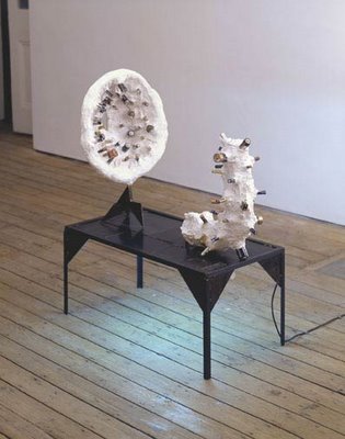
The current issue of Art in America (Nov. 2006) is focused on Los Angeles. One big section presents interviews with 19 sculptors. The interviews are edited—the questions have been removed—so unfortunately everyone sounds like a rambling motormouth. But the reading is fun once you adjust. Below are some interesting quotes from the interviews. Note that a couple of the artists refer to “THING,” a widely reviewed exhibit at the Hammer Museum in 2005, whose full title was “THING: New Sculpture from Los Angeles.” The above image is a 2005 work by Evan Holloway, called "Power," which includes a few of the dead batteries that he collects. (Image from the website of The Approach, London.)
Liz Larner
A lot of young artists are romantics. Color plays a big role, and a kind of flickering, bourgeois subject matter; and there’s a kind of forgetting of history—it’s all about now.
Perhaps the whole love of pop culture in recent decades wasn’t such a good idea. Maybe that bred some kind of thinking that people just want to get by—that they are trying to hold things together, they’re not trying to break them apart.
Evan Holloway
Nothing is more important than a local conversation with my friends, where I’ve seen their work through time, seen it physically develop over the years, and they’ve done the same with my practice.
Jason Meadows
L.A. is not a town where critics are really important. There are several good critics here, but they have less of a voice here than critics do in, say, New York, because there is no real publication that comes out of L.A.; there’s no forum for them. I don’t regret the situation, because the critic’s voice has never been important to me. They do their job and I do mine. The lack of a magazine or specific critical discourse means that I have more space to go my own way….
Liz Craft
I used to make these mega-dense pieces. It was like I was trying to put everything I knew into one monster work. Finally, when I got older, I was able to separate ideas and make them into separate pieces. That may have made it easier for more people to buy my stuff.
Mindy Shapero
It’s mostly art fairs that are supporting me.
There were some decisions made about the [“THING”] show that I was not convinced of—inclusions and the overall installation—and I was not excited about the title of the show. I did not ask enough questions; if I had asked more, I might have turned it down. My work is not about thingness, it is not object-oriented; it’s narrative-based, and the works flow from piece to piece, including from drawing to sculpture. It’s fluid.
There is a lot of really interesting work, by people both over 30 and under, that is being made and not being shown.
Olga Koumoundouros
I have a problem with long-term assistantships. It can be highly exploitative and demoralizing to be doing full-time quasi-factory work when you have your own voice. Repetitive labor with your hands is alienating. So much of the energy that you need to bring to your own sculpture is physical: using it up on someone else’s work is not healthy. I have seen people end up being kind of paralyzed….
Jennifer Pastor
With the “Thing” show I was surprised and excited by how many younger artists were making sculpture. There was a genuine lustiness about materials, which I really liked also, though I think that the original playfulness and lustiness for materials sort of petered out into contentment with stuff. You can see the influence of sculptors from previous generations, but what is sometimes missing is the toughest part of that influence.
Eric Wesley
Ignorance protected me when I was a student. Art students are too smart now. They are the latest installment of yuppie culture.
Mike Kelley
I am not famous in Los Angeles; in the school where I teach [Art Center College of Design, Pasadena] I’m less important than an auto- or product-designer.
I like to keep my hands in the work, but I also have assistants. If touch is important, I do the work myself. I paint my paintings myself because I haven’t found anybody whose color-mixing skills match my own. I don’t really enjoy the labor, though; I prefer thinking things up to making them.
A New Report on Fake Diebenkorns
In the spring of 2000, an abstract painting was offered on eBay for next to nothing by a guy who claimed he'd purchased it in Berkeley at a garage sale and, now married, was getting rid of it to please his wife. He made no claims about who painted it. But a photo revealed an identifier on the work, “RD52”—the style of marking used by Richard Diebenkorn to sign and date his paintings. And Diebenkorn did live in the Bay Area in the 1950s. His work has sold for large sums since his death in 1993 (one painting sold for $3.9M). So the eBay sale got noticed, bids escalated, and bidding closed at about $136,000.
The sale also caught the attention of art experts who judged the painting to be fake. The New York Times reported about it. Officials at eBay looked into the sale and, discovering one irregularity in the process, cancelled the transaction. The FBI investigated. Nearly a year later, a young Sacramento attorney named Kenneth Walton was indicted, along with two conspirators, for shill bidding in this transaction and hundreds of others on eBay. Under a plea bargain, he agreed to pay partial restitution, stay away from eBay, and relinquish his license to practice law.
Eventually Walton wrote a book about his crimes—receiving good reviews. He admits that he forged Diebenkorn's signature on a painting purchased from an antique shop and then fabricated a back-story to sell it.
Now the Sacramento Bee has reported a new case of forged Diebenkorns, in an article by staff writer Blair Anthony Robertson dated 10/15/06. According to the report, in 2005 an artist named Henry Villierme sued a prominent Northern California art dealer, John Natsoulas, claiming that Natsoulas had forged Diebenkorn’s signature on old paintings by Villierme that were on consignment to the dealer. Villierme had been a student of Diebenkorn and had painted in a similar style in the 1950s and 1960s before dropping out of the art world to pursue a banking career.
According to the article, two of the allegedly forged Diebenkorns were sold to California collectors, and another was sold to Paul Thiebaud, San Francisco gallery owner and son of the noted painter Wayne Thiebaud. One of the works was reproduced in a book published by Sacramento’s Crocker Art Museum. An errata slip had to be inserted once the true creator of the painting came to light.
The lawsuit was settled out of court this past summer, and the parties have clammed up. There is a public interest in this case that has not yet been served. Maybe a prosecutor is looking into what happened. In any case, dark clouds remain.
Saturday, November 04, 2006
Stefan Kürten at Hosfelt (SF)
At Hosfelt Gallery, the new paintings by Stefan Kürten were mostly sold prior to the opening reception. Since each painting went for the price of a new car, this was a feat, at least for San Francisco. (Hosfelt has a New York branch, which surely helped.)
The sales are a mark of Kürten's appeal. In the current show, and an earlier one in New York, I found the work seductive, but to some extent the glamour put me on guard. I wondered how much substance was beneath it. I went looking for a core.
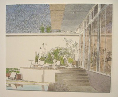
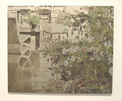
According to a typology once used by Isaiah Berlin in discussing Tolstoy, Kürten is a hedgehog rather than a fox. He mines one territory and doesn't gad about. His paintings typically depict a suburban home, modernist in style but evidently built years before, in a setting that contains vegetation. The homes are middle-class, or upper middle-class. The exterior of the house may be engulfed in mature plantings. Or there may be a patio with sparser plantings and modern furniture. In one case, a living room features a Wiggle Chair by Frank Gehry and, in the foreground, a loose style of Christmas tree. In another instance, a trim set of row houses is arrayed behind a miniscule set of front yards. People, animals, and incidental personal belongings are not seen.
The painting style has echoes of Van Gogh, Klimt, and others, but it is a particular style that is recognizably Kürten’s. Using oil on canvas, he paints thinly in colors that are muted, sometimes washed out. The ground layer is allowed to show through to varying degrees. Often the ground is gesso tinted with soft metallic paint, gold or silver. In other cases, a white ground is used. The imagery is built up with small brush strokes that mimic brick walls, shingled roofs, paving blocks, shrubbery, and so on. There is a great emphasis on patterns. There is also a fascination with the qualities of reflective surfaces, which are superbly rendered. The overall structure is firm, yet there is spontaneity in the brush strokes.
The paintings can look like illustrations from faded architectural magazines. The metallic underpainting operates like mood music to stir feelings of nostalgia. Even when the underpainting is white, the image looks vintage. The canvases could be seen as hushed memorials to safer days and tidier ideals. Less charitably, they could be viewed as sentimental.
Or perhaps the work is ironic? It might be seen as taking swipes at the 20th Century, modernist bourgeois division. The message could be "look at these ideals, they were dead ends."
There is perhaps some vamping in both directions, nostalgia and irony. But the core strength of the work lies in its invitation to contemplate. Ultimately Kürten seems more interested in evoking cultural moments than in triggering a prescribed response.
He is not a neutral observer of course. Each location that he depicts seems cut off. The houses look comfortable but deserted. The spaces are generous, but are hemmed in by strong (even psychedelic) patterns of brick, shrubs, and so forth. In some instances, a patterned sky invades the space like a hallucination, which intensifies the feeling of claustrophobia. Overall, there is pervasive tension, a sense of things at an end, and various implied questions: What happened? What next?
The work has limitations. A roomful of it can leave your wanting a fuller account. The world is so much bigger than this. And occasionally, the encoding doesn’t work—the painting devolves into a genre piece.
When Kürten is at his best, though, the results are terrific. Don’t miss the opportunity to see his work in person. Photographs can't do it justice. But I have included a few images (the first one is from the gallery website).
Thursday, November 02, 2006
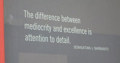
Mediocrity Within Reach
The above quote adorns the entryway of a Design Within Reach store in a neighborhood I frequent. Who is this Sebastian J. Barbarito? A Google search turns up only a few instances of the same quote. There is no other trace of this person.
Seeing this, I thought of a remark attributed to the architect Mies van der Rohe: “God is in the details.” The Barbarito quote could be Mies re-processed by a management consultant.
Note that the Barbarito can, strictly speaking, be read two ways. It might mean that attention to detail is a path to mediocrity! And that’s even true: people often miss the big picture.
Also note, in the picture above, that “Sebastian” is misspelled. So Mies was right—the God of Laughter stopped by.
Brisk Words from Sonia Delaunay
The artist Sonia Delaunay was born in Ukraine in 1885, grew up mostly in St. Petersburg, and moved to Paris in 1905. She married artist Robert Delaunay in 1910 and co-founded with him the artistic movement known as Orphism. At age 89, she was interviewed for Cindy Nemser's collection, Conversations with 15 Women Artists (1975). She was formidable, as the French say, and her remarks in that interview were blunt. Here's a sample:
——
S.D.: “I have no dealer. I’m quite free.”
——
S.D.: “It’s a false idea you have—an American idea that artists must be famous.”
——
S.D.: “Robert [Delaunay] was not secure at all.”
Interviewer: “Do you think that’s why he wanted to explain [his art]?”
S.D.: “Yes.”
——
S.D.: “…people don’t say much now. They speak only of money.”
——
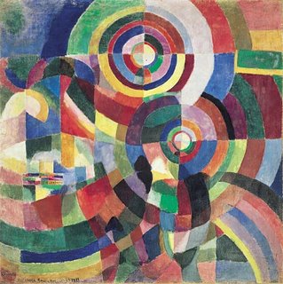
At the top is a painting by Sonia Delaunay from 1914 (image from Centre Pompidou).
——
S.D.: “I have no dealer. I’m quite free.”
——
S.D.: “It’s a false idea you have—an American idea that artists must be famous.”
——
S.D.: “Robert [Delaunay] was not secure at all.”
Interviewer: “Do you think that’s why he wanted to explain [his art]?”
S.D.: “Yes.”
——
S.D.: “…people don’t say much now. They speak only of money.”
——
At the top is a painting by Sonia Delaunay from 1914 (image from Centre Pompidou).
Subscribe to:
Posts (Atom)