Alert: This exhibit is scheduled to close on 10/14/06. Gallery hours (limited) are posted on the website.
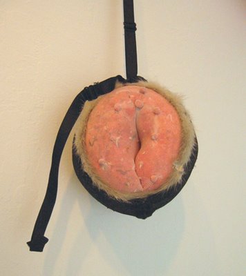
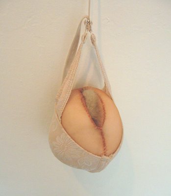
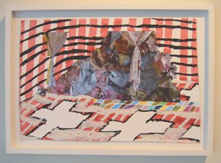
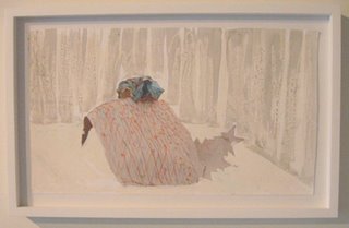
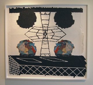
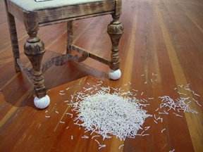
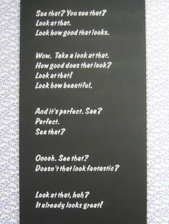
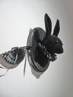
The tiny 301 Bocana Gallery, in the Bernal Heights area of San Francisco, has a show of new fabric sculptures by Seattle artist Jennifer McNeely. Most of the pieces are designed to hang from the wall. The materials include brassieres, nylon stocking, bits of fur, stuffing, and thread. There are a couple of larger works, but majority here could be held in your hands. Not that you would do that. You’re a good gallery patron, and besides you might want to run for Congress some day. If someone snapped a photo…. We’re talking erotic and comic, brazen and silky. This is no occasion to say, "Nice piece!" McNeely’s local solo debut was at The LAB in late 2005. Both the wit and forms seem sharper in the new show. Here are three more examples, in addition to the bunnyesque construction at the top:
Saturday, September 30, 2006
Thursday, September 28, 2006
David Huffman at Patricia Sweetow (SF)
Alert: This exhibition is scheduled to close on 10/14/06.
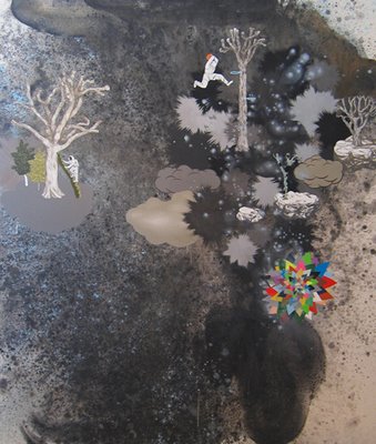
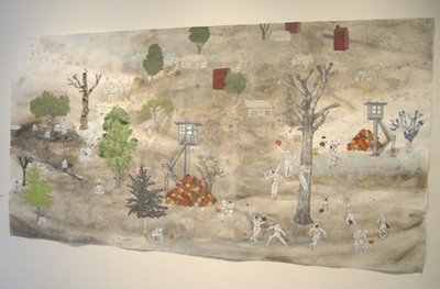
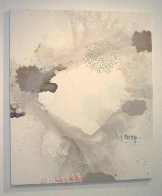
At the Patricia Sweetow Gallery, there is a splendid show of new paintings by David Huffman. He continues to explore a style developed under the influences of Chinese and Japanese landscape painting, African-American history, Japanese anime, and other sources. A new source is the Katrina disaster in New Orleans. In this show, Huffman's work is richer than ever.
The representational elements in Huffman’s work are typically interpreted as social commentary. The imagery certainly represents Huffman’s experience as an African-American man who has an awareness of history and politics. Along with social awareness, there is an existential element—a sense of humans as small creatures who must operate in a vast, unstable, and dangerous world.
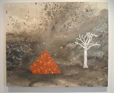
In the current paintings you can see black astronauts playing and working together, explosions, clouds of smoke, starbursts, slave cabins, surveillance towers, pyramids of basketballs, desolate terrain, outer space vastness, lynchings, dead trees, healthy trees, and other visual themes. The emotional tone doesn’t resolve one way or the other. This complexity keeps the work vibrant.
Huffman uses imagery but doesn’t let it box him in. His strategy is to signal awareness rather than send a message. The thematic material registers, but it also serves as a platform for launching into the formal issues of painting. A deep interest in visual qualities is everywhere apparent in the work. Composition, paint handling, and color palette are all superb. According to Huffman, some of the new work incorporates paint that glows under black light. (There are no black lights in the show.)
The paintings are mostly medium-large to large, and they need to be seen in person. The image at the top was adapted from the gallery website. Here are three other examples (my own photos, quite inadequate):
Wednesday, September 27, 2006
Daniel Tierney at Ping Pong Gallery (SF)
Alert: This exhibition is scheduled to close on 10/14/06.
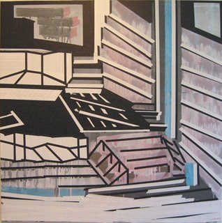
The artist-run Ping Pong Gallery has come up with another good show. The featured artist is Dan Tierney, who has been working out the aesthetics of layering paint and painted tape on top of mainly abstract photographic images. To make the photos, he paints on large sheets of paper and then roughly assembles them into various sculptural forms to create a kind of landscape. Photographs of these assemblages are then processed via computer. The resulting images then undergo various degrees of obliteration as he applies paint and tape. One of his key aesthetic problems is to make the flat photographic surface hold its own with the more tactile materials placed on top of it. In prior viewing of his work, I thought the photographic elements tended to remain stubbornly distinct and visually flat.
This new show demonstrates progress and to some extent departures. The work has evolved notably in just a few months. In some works the obliteration of the photographic is extreme. There are issues of conservation (especially for the heavily taped pieces), but the compositions are lively.
Above is an image of a smaller work in the show. Below are three other examples. The first (quite a beauty) is also smaller; the others are in the 4' x 4' range.
Ping Pong has limited hours, but an eager willingness to be open by appointment. The location is the Dogpatch neighborhood in San Francisco. The charming co-directors are Vanessa Blaikie and Joey Piziali.
Sarah Cain at Anthony Meier
Alert: The exhibition is scheduled to close on 10/13/06.
Anthony Meier Fine Arts is presenting a solo exhibition of work by Saran Cain, an artist still in her twenties who is one of five winners of the 2006 biennial SECA Award sponsored by SFMOMA and one of its auxiliaries, the Society for the Encouragement of Contemporary Art (SECA).
Although Cain makes a share of work in traditional formats (paint on canvas, paint on paper), she also has a long-standing interest in upending expectations about form. Prior to entering graduate school two years ago, she carried out some captivating installations. As a candidate for the 2004 round of SECA awards, she took over an empty apartment and created a kind of a sublime funhouse of visual surprise and contemplation. Parts of that project rest happily in my memory.
Recently, she has seemed more interested in discrete art objects, but there is still an interest in unorthodox forms. In her Berkeley MFA show this past spring, there was a piece conceived around a long tree branch leaning against the wall. It looked shamanistic. It was my favorite in a show that overall left me disappointed.
Another area of experiment lately has been efforts to obliterate the rectilinear edges of paintings by incorporating feathers and other materials around the perimeters. I see these as related to her installation work, as efforts to reach out into space. A couple of these works are in the current exhibit. Thus far, I have not been persuaded by these works. They can look like craft projects gone awry. But they do pose an interesting problem; they may lead to discoveries.
I am sorry to report that much of the work in this show seems inert. I’m not sure I understand why. Maybe a temporary after-effect of grad school? Also, the display of so many large works in the gallery’s hallway does not help.
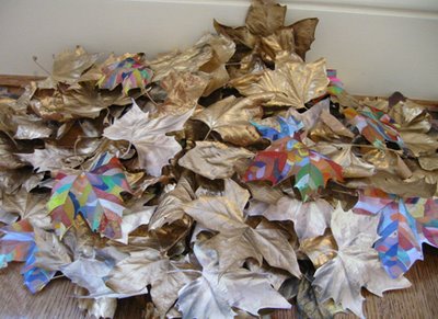
Still, it’s a show to be seen. One of my favorites is unorthodox: a pile of leaves on the floor (photo at top). There are 59 painted leaves, some gold and some multi-colored, plus 29 color copies of leaves.
Another pleasure was a large work on paper (photo below) that has a visual structure reminiscent of Lee Bontecou but without Bontecou's grimy palette, and a feeling of expansion rather than containment. Cain's palette seems exuberant, although the title is “Hello Darkness My Old Friend.” The materials are conventional except for the incorporation of tiny round bells and Eucalyptus seed pods.
The gallery is located in an imposing house on a residential block of California St. in San Francisco. You need to ring for entry. There are regular gallery hours, but it’s a good idea to call before visiting so the helpful staff knows to expect you.
A Psychopath's Reading List
Recently I read Maureen Orth's account of the murder spree committed in 1997 by Andrew Cunanan, the young San Diego man who fabricated sophisticated images of himself to succeed in the fast lane of gay society. To fuel this life, he trafficked in sex, drugs, money, and power—until he imploded. During quiet moments, he read a good deal, which helped him converse with the older gay men whose approval and money he sought. The reading habit continued when he was holed up in Miami Beach after killing Gianni Versace. Among the books found in his rented room were Kenneth Clark's The Romantic Rebellion (a study of Romantic versus classic art), John Updike's collection of essays on art, Just Looking, and a book about the painter Francis Bacon. Put that in your pipe and smoke it.
This information comes from page 317 of the 1999 hardback edition of Vulgar Favors: Andrew Cunanan, Gianni Versace, and the Largest Failed Manhunt in U.S. History. The book shows off the author's investigative skills, but the prose is often lurid and disorderly. The strength of the book is Cunanan himself, a riveting monster. Also interesting are the depictions of ludicrous incompetence by the police.
Hamburger Eyes at Steven Wolf (SF)
Alert: This exhibtion is scheduled to close on 9/30/06.
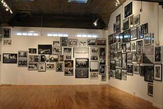
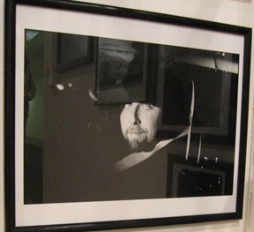
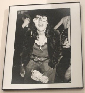
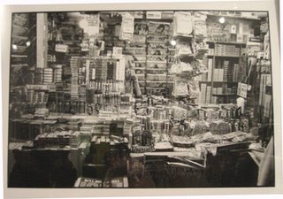
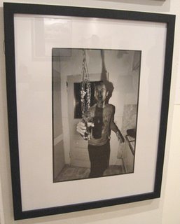
Steven Wolf Fine Arts has turned its main space over to Hamburger Eyes, a collective based in San Francisco that has earned a good reputation for its photo zine, published as a limited-edition. Many of the photos in the show have appeared in the zine. It’s a crowded show in the typical Hamburger Eyes style (part of the show in shown above in a photo taken from the gallery website).
During my limited time at the gallery, a few works jumped out at me. Here are photos by Ray Potes of a man and a woman:
Here's another Ray Potes shot of a cigarette stand in New York:
Here is a photo by Stefan Simikich of a man tossing water :
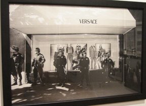
Finally, here’s a photo of riot control by Uri Korn (who works at the gallery):
Shawn Smith + Hadi Tabatabai (at Wirtz)
Alert: This exhibit is scheduled to close on 9/30/06.
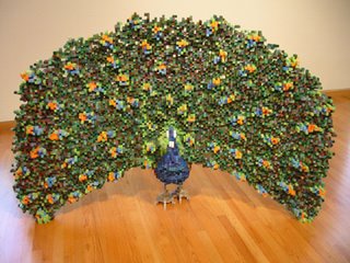
Stephen Wirtz Gallery in San Francisco is exhibiting two artists who, except for a shared interest in modularity and grids, are wildly different. Shawn Smith shows sculptures of animal forms that bring pixelation into 3-D. It’s an idea that Tom Friedman has used (e.g., a male figure constructed of sugar cubes), but Smith makes it his own. He assembles his objects from square rods cut from plywood (or plain wood) that are colored with ink.
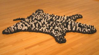
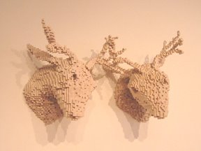
The most spectacular concoction is a peacock (image at top). Other terrific pieces are a bear rug (image above) and a pair of animal heads (deer? elk?) with antlers grown together (image below). All the work in the show is interesting.
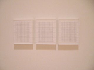
Hadi Tabatabai’s work is also meticulous but to different ends. He creates wall pieces using a grid language that brings to mind Agnes Martin. The dominant color is white (or near white). The materials are wood, thread, and acrylic paint. When thread is used, it is tightly strung across the surface to create lines that hover and almost disappear. Portion of the thread array may be painted to create another grid pattern. Some of the work held a quiet enchantment; but others registered as over-determined and dull. One of the better works was a thread triptych, shown below.
Group Show at Front Gallery (Oakland)
Alert: This exhibit is scheduled to close on 9/30/06.
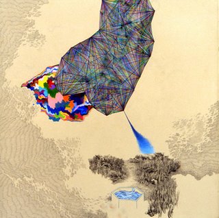
The current exhibit at Front Gallery (Oakland) is worth a visit. It’s a four-artist show entitled “Dowser’s Delight (Divining the Inner Cartographic Impulse).” One of the artist, Casey Jex Smith, has been doing a series of drawings that bring together different styles of representation, using different media, in compositions that suggest cosmic forces at work. He has set a difficult problem for himself, and some works in this series do not strike me as coherent. His successes, however, are a joy to behold. The show includes a superb instance, entitled “The Fountain of Youth in Proxy for the Tree of Life," This 22" x 22" work on paper employs ink, marker, and colored pencil (photo above, adapted from the artist’s website). This work with its hundreds of marks shows an exceptionally fine hand. Two other drawings are also on view.
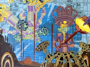
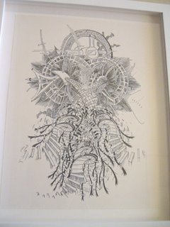
Chris Pew also makes a good showing. There are a couple of paintings that display a fascination with modular shapes deployed in an artificial space that is indebted to sci-fi and perhaps video games. One of these is “Outside the Region of Eternity,” a 22" x 30" work of acrylic on paper (photo above, from the Receiver Gallery website). But I was more captivated by the small ink-on-paper drawings (example below).
Tuesday, September 26, 2006
“Some Assembly Required” at The LAB
Alert: The exhibit is scheduled to close on 9/30/06.
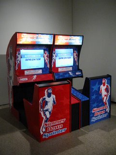
The current exhibit at The LAB in San Francisco, entitled “Some Assembly Required,” is as uneven as most shows there, but there are three pieces that you shouldn’t miss. The most ambitious is Steve Lambert’s “Simmer Down Sprinter,” a marvelous two-person video game in which the on-screen sprinter (Lambert himself) runs faster as the player relaxes. Relaxation is measured via the hand, somewhat in the manner of lie detector tests. You have to try this! Line up! (The above photo shows the equipment.)
In shows elsewhere, I have seen paintings by Zefrey Throwell that were not to my taste. But his video here, “Maidenhead Voyage into Dark Waters,” is a winner. He has recorded brief, very frank interviews with a number of young people in which they describe losing their virginity. One of the clips should have been omitted for poor technical quality, but otherwise this is a delight. You’ll be sorry if you miss it.
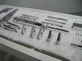
Taro Hattori reprises his “Beaut Brute II” installation, recently seen at Kala Institute in Berkeley (detail above, from the Kala show). On a conveyor belt constructed of wood and covered in white vinyl leather and white faux fur, he presents an orderly array of machine gun parts made from mirrored plastic. A strange grape arbor hangs in the background. It’s a work that will stick in your mind.
The exhibition was based on an open call; the jurors were artist Michael Arcega and gallery-owner Steven Wolf.
“Home Ec” at Michelle O’Connor
Alert: This exhibit is scheduled to close on 9/28/06.
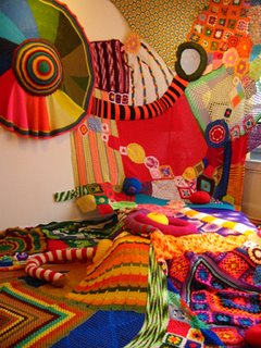
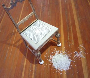
At the Michelle O’Connor Gallery, a show entitled “Home Ec” presents work inspired by home crafts. Sarah Applebaum has created a “bedroom” that you can walk into with shoes off (photo above depicts a large section). Christina La Sala presented a modified chair (2 photos below).
Julia Petho used latex on canvas to record conversational excerpts from FoodTV (detail below).
Elide Endreson offered a black-on-black wall sculpture that looked like a Goth party decoration (detail below).
Note: This gallery is open by appointment. Call (415) 990-7148. The location is the fourth floor of the Blue Studio building, 2111 Mission St., at 17th St., San Francisco.
Game Plan
In the next few posts I’ll cover some interesting exhibits that are closing shortly. Then I’ll survey some other recent shows. Finally, as time permits, I’ll backtrack to some of the estimated 100 shows that I viewed this summer in San Francisco, Oakland, Ojai, and Los Angeles.
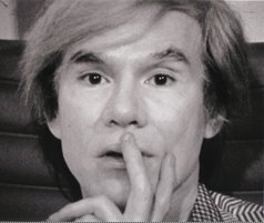
Warhol as an “American Master” (PBS)
I tend to wince when people use the words master and masterpiece. Ditto with the word genius. These words have been tainted by middlebrow culture, which wants art to be pre-digested, neatly packaged, and covertly pious.
Anyway, PBS has just broadcast a 4-hour documentary about Andy Warhol in the “American Masters” series. Some of the interviewees dug deep and spoke of Warhol as a “genius.”
The program’s real annoyance, though, was the goddamn non-stop background music. There was even music during clips from Warhol’s early silent films—a blithe falsification. The contemporary fear of silence is raising its ugly head just about everywhere.
The documentary’s talking heads are sometimes engaging, sometimes a bit full of themselves. There was a smidgen of perverse pleasure in watching a bevy of sophisticates faun over man who is, you know, dead.
No single film, even at four hours, could encompass Warhol as artist, personality, and gay icon. In addition to seeing his work, you need to read some of the key books about him to grasp the many facets of his life and how they fit together. Still, the film manages to core-sample many areas of the work and the life. Of course, it's reticent on the tawdry and smutty side of things. There are gestures toward candor, but the reporting is, shall we say, Americanized. On the other hand, I'm happy the film reminds us of Warhol's exemplary qualities: his diligent working habits, enterprising attitude, curiosity, deadpan humor, sociability, and grit in overcoming adversity. When the film is shown in schools, Warhol's story will bring uplift to young pansies everywhere.
The title is “Andy Warhol: A Documentary Film.” The filmmaker is Ric Burns, brother of Ken. A DVD will be released in November on PBS Home Video. (Is it too much to ask for a “Music Off” option?)
Of course, if you like the music, the Original Soundtrack will be released on CD. I'm not fooling!
[The photo above is from another source. Credit: Michael Blackwood Productions.]
Architect Chosen for Berkeley Museum
Today the University of California, Berkeley announced that Japanese architect Toyo Ito has been selected to design the new building for the Berkeley Art Museum and Pacific Film Archive. The new facility will replace (in a different location) the cantilevered concrete Modernist building by Mario Ciampi and associates, which which opened in 1970. In the wake of the 1989 Loma Prieta earthquake, the Ciampi building was judged to be seismically unsound.
Several months ago, the university announced the five finalists for this commission—an exhilarating list of international talents. The choice of Toyo Ito is interesting. This will be his first major project in the U.S, according to the press release. He has done many buildings in Japan, where he was born in 1941. His work is known for a sense of lightness and transparency and to some extent for its references to organic forms.
The new structure will be located on a sizable parcel of land in downtown Berkeley, a block from the Berkeley BART station. This should attract more visitors from San Francisco and other parts of the Bay Area. The museum has managed to carry out a distinguished art exhibition program despite limited resources, and the film archive (also on a modest budget) has offered the public an extraordinary film program for decades. It will be wonderful to have these resources more easily accessible.
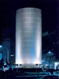
Here are a few photos of architecture by Toyo Ito and Associates. First, two shots of the Tower of Winds (Yokohama, Japan), which is a ventilation and water tank facility atop a shopping center. It appears as an aluminum column by day but becomes transparent at night, with lighting effect activated by wind and sound:
Now, two shots of the Sendai Mediatheque (Sendai, Japan), a cultural center:
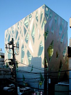
A shot of a building in Tokyo for the Italian fashion house Tod’s:
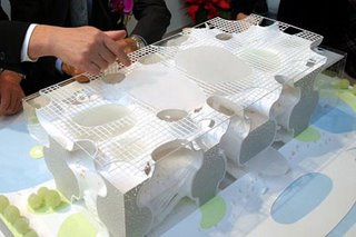
Finally, a model for the Taichung Opera House (Taiwan):
Picture sources:
http://www.noemalab.org/sections/specials/tetcm/2002-03/toyo_ito/architettura_citta.html
http://blog.livedoor.jp/modernarchitecture/archives/cat_50003074.html
http://jeff-turko.net/
http://www.wirednewyork.com/forum/showthread.php?t=6501
http://blog.miragestudio7.com/2006/02/taichung-metropolitan-opera-house/
Monday, September 25, 2006
Rolando Villazón in Song
[This review doesn’t belong in a visual art blog, but I’m posting it here until I have time to create a blog for a grab bag of other experiences.]
Today (Sunday) I attended a performance where I sank in disappointment while most of the audience clapped themselves into multiple standing ovations. The event, in Berkeley, was a classical song recital by opera tenor Rolando Villazón. The question going in was whether he is the sort of opera star who also can handle the song repertoire, or not.
The real test came in the first half: Robert Schumann’s song cycle, “Dichterliebe.” This can be a remarkably transporting series of songs, despite the rather flat-footed Lieder texts (by Heine, no less). Faced with the outstanding performance tradition for this cycle, any young singer who performs it risks some stark comparisons. In my view, Villazón did not measure up.
In the first place, his German enunciation is fuzzy at best. For Lieder, the words are vital not just for their meaning but also for the way they underpin the melodic line. The consonants are particularly important as pulse-points. In Lieder (and all types of songs, really), a neglect of enunciation leaves an impression of flaccidness.
Another problem was the lack of a fine-knit vocal line—what is usually called “legato.” Villazón has shown a fine legato in opera singing, but Lieder demands an even more calibrated approach to capture the small-scale nuances that are its hallmark. I found Villazón’s phrasing to be choppy. Sometimes, this seemed to stem from a tendency to impose an operatic sense of drama on a repertoire that is essentially lyrical.
A savvy Lieder singer doesn’t try to conquer through assault. Instead, he or she draws the audience in, so they feel suddenly privy to another person’s emotional state. Villazón’s approach lacked the feeling of inwardness that Lieder requires.
The disappointment struck in the first song, “Im Wunderschönen Monat Mai” [“In the wonderfully beautiful month of May”]. This should convey a feeling of emotional expansion after the narrow confines of winter. Villazón somewhat tortured rendition missed altogether the sense of dreamy unfolding.
The singer elected to perform the cycle with the printed score at hand, rather than strictly from memory. Usually this is a sign of inadequate preparation. Oddly, when he began to rely on the score more fully in the later parts of the cycle, and even gripped the music stand with both hands, his interpretation became more focused.
The second half of the recital offered an assortment of songs in Italian, French, and Spanish (with four encores). This proved that fuzzy enunciation is a general characteristic of Villazón’s song performances—even in his native Spanish. And in French, some of his sounds were not only unclear, but incorrect. In regard to vocal technique, I heard little glitches in the way he moved his voice in passages that required agility. (If you watch films on DVD, you know that even fraction-of-a-second glitches in picture and sound register unpleasantly.) Finally, I will mention that his selection from Bononcini’s “Griselda” lacked the poise that makes this type of music flower. Little pauses between phrases carry weight in the Italian Baroque, and I didn’t feel they were given their due.
Since the audience loved the recital, I’m guessing that it was an opera audience rather than a song audience. The louder he sang, the more they liked it. Opera people (and I’m one) are always hungry for big sound. But the classical song repertoire requires more finesse than power. You might say it’s like the State Department, rather than the Pentagon.
To hear what Villazón can do in opera, listen to his superb CD of arias by Massenet and Gounod. Singing of this caliber invigorates selections that otherwise, with lesser artists, can seem little more than over-ripe late Romanticism.
Today (Sunday) I attended a performance where I sank in disappointment while most of the audience clapped themselves into multiple standing ovations. The event, in Berkeley, was a classical song recital by opera tenor Rolando Villazón. The question going in was whether he is the sort of opera star who also can handle the song repertoire, or not.
The real test came in the first half: Robert Schumann’s song cycle, “Dichterliebe.” This can be a remarkably transporting series of songs, despite the rather flat-footed Lieder texts (by Heine, no less). Faced with the outstanding performance tradition for this cycle, any young singer who performs it risks some stark comparisons. In my view, Villazón did not measure up.
In the first place, his German enunciation is fuzzy at best. For Lieder, the words are vital not just for their meaning but also for the way they underpin the melodic line. The consonants are particularly important as pulse-points. In Lieder (and all types of songs, really), a neglect of enunciation leaves an impression of flaccidness.
Another problem was the lack of a fine-knit vocal line—what is usually called “legato.” Villazón has shown a fine legato in opera singing, but Lieder demands an even more calibrated approach to capture the small-scale nuances that are its hallmark. I found Villazón’s phrasing to be choppy. Sometimes, this seemed to stem from a tendency to impose an operatic sense of drama on a repertoire that is essentially lyrical.
A savvy Lieder singer doesn’t try to conquer through assault. Instead, he or she draws the audience in, so they feel suddenly privy to another person’s emotional state. Villazón’s approach lacked the feeling of inwardness that Lieder requires.
The disappointment struck in the first song, “Im Wunderschönen Monat Mai” [“In the wonderfully beautiful month of May”]. This should convey a feeling of emotional expansion after the narrow confines of winter. Villazón somewhat tortured rendition missed altogether the sense of dreamy unfolding.
The singer elected to perform the cycle with the printed score at hand, rather than strictly from memory. Usually this is a sign of inadequate preparation. Oddly, when he began to rely on the score more fully in the later parts of the cycle, and even gripped the music stand with both hands, his interpretation became more focused.
The second half of the recital offered an assortment of songs in Italian, French, and Spanish (with four encores). This proved that fuzzy enunciation is a general characteristic of Villazón’s song performances—even in his native Spanish. And in French, some of his sounds were not only unclear, but incorrect. In regard to vocal technique, I heard little glitches in the way he moved his voice in passages that required agility. (If you watch films on DVD, you know that even fraction-of-a-second glitches in picture and sound register unpleasantly.) Finally, I will mention that his selection from Bononcini’s “Griselda” lacked the poise that makes this type of music flower. Little pauses between phrases carry weight in the Italian Baroque, and I didn’t feel they were given their due.
Since the audience loved the recital, I’m guessing that it was an opera audience rather than a song audience. The louder he sang, the more they liked it. Opera people (and I’m one) are always hungry for big sound. But the classical song repertoire requires more finesse than power. You might say it’s like the State Department, rather than the Pentagon.
To hear what Villazón can do in opera, listen to his superb CD of arias by Massenet and Gounod. Singing of this caliber invigorates selections that otherwise, with lesser artists, can seem little more than over-ripe late Romanticism.
Subscribe to:
Posts (Atom)