At
Queen’s Nails Annex (QNA), a storefront artist-run space, Margaret Tedesco has curated a show of three artists, using a title from the Yardbirds. The song is older than most visitors to the gallery, but it asks an up-to-date question: when will it end? That’s not the point of the show, though. The idea was to present a surround-sound experience in mixed media. But let’s not lean too hard on that.
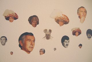
In the front room, Wayne Smith has splattered one wall with two sets of images. One set consists of small drawings on paper of lone surfers in the water. I assume these are based on photos. The images are covered by laborious cross-hatching in ballpoint pen, which creates several effects at once. They look pixelated, like TV. They look distanced, like memories. And they look a bit Japanese, like paintings on silk. (The lines played havoc with my camera; I couldn’t get a good image.) The work has an appeal, but I think a few larger drawings in this vein would have been more compelling. Cramming several dozen tiny drawings on the wall seems to trivialize the project. In the remaining area, Smith uses tiny images to better effect. He has affixed dozens of cut-out headshots of the (now dead) late-night TV host, Johnny Carson. They form a fizzy horizontal stream representing Carson through the years. It’s an homage to a public face (detail above).
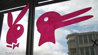
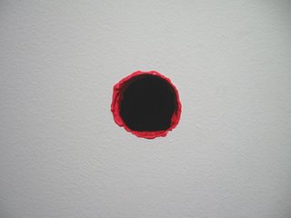
On the front window, David Hatcher (Los Angeles) installed graphics of two famous rabbits, the Playboy bunny symbol and what appears to be Wittgenstein’s version of the rabbit-or-duck illusion. Please decode this diptych for me so I know why I like it (photo above). Nearby, Hatcher painted the edge of a hole that happened to be in the wall (photo at top). Who said geometry can’t be seductive?
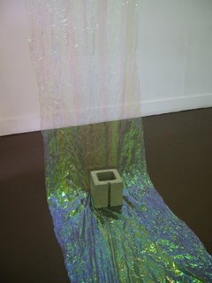
The back room is Mitzi Pederson’s domain. There are two large sculptures and two groups of small drawings. One construction, employing fairly simple means, shows off Pederson’s interest in the fundamentals of sculpture: opacity vs. transparency, lightness vs. weight, light absorption vs. reflection, blandness vs. gaudiness, tension vs. limpness, etc. (A detail is shown above.) The other sculpture carves out an even larger space, making the room feel crowded. It was hard to photograph in there. All in all, I felt that Pederson’s recent installation at the CCA graduate gallery, noted on March 30th, was more successful.
 At Queen’s Nails Annex (QNA), a storefront artist-run space, Margaret Tedesco has curated a show of three artists, using a title from the Yardbirds. The song is older than most visitors to the gallery, but it asks an up-to-date question: when will it end? That’s not the point of the show, though. The idea was to present a surround-sound experience in mixed media. But let’s not lean too hard on that.
 In the front room, Wayne Smith has splattered one wall with two sets of images. One set consists of small drawings on paper of lone surfers in the water. I assume these are based on photos. The images are covered by laborious cross-hatching in ballpoint pen, which creates several effects at once. They look pixelated, like TV. They look distanced, like memories. And they look a bit Japanese, like paintings on silk. (The lines played havoc with my camera; I couldn’t get a good image.) The work has an appeal, but I think a few larger drawings in this vein would have been more compelling. Cramming several dozen tiny drawings on the wall seems to trivialize the project. In the remaining area, Smith uses tiny images to better effect. He has affixed dozens of cut-out headshots of the (now dead) late-night TV host, Johnny Carson. They form a fizzy horizontal stream representing Carson through the years. It’s an homage to a public face (detail above).
 On the front window, David Hatcher (Los Angeles) installed graphics of two famous rabbits, the Playboy bunny symbol and what appears to be Wittgenstein’s version of the rabbit-or-duck illusion. Please decode this diptych for me so I know why I like it (photo above). Nearby, Hatcher painted the edge of a hole that happened to be in the wall (photo at top). Who said geometry can’t be seductive?
 The back room is Mitzi Pederson’s domain. There are two large sculptures and two groups of small drawings. One construction, employing fairly simple means, shows off Pederson’s interest in the fundamentals of sculpture: opacity vs. transparency, lightness vs. weight, light absorption vs. reflection, blandness vs. gaudiness, tension vs. limpness, etc. (A detail is shown above.) The other sculpture carves out an even larger space, making the room feel crowded. It was hard to photograph in there. All in all, I felt that Pederson’s recent installation at the CCA graduate gallery, noted on March 30th, was more successful.

1 comment:
Hi. I found your blog through Modern Art Notes (a daily read). Glad to have a source for what's happening in San Francisco. Here on the east coast, it's too easy to become provincial.
Post a Comment