Tuesday, October 24, 2006
Paul Wackers at Eleanor Harwood (SF)
Alert: This exhibit is scheduled to close on 11/24/06.
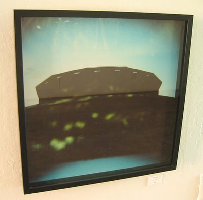
San Francisco painter Paul Wackers makes a strong impression in a solo exhibit at Eleanor Harwood Gallery. His previous solo outing was in a tiny record store, now closed. That was a good show, but this one is better. I would say this young artist is on the cusp, with plenty of attention headed his way.
Most of the work on view is acrylic on panel. The paint lies flat on the surface. The palette tends to be dark, a result of seeking fine color gradations through paint mixing. Even when the work looks dark, you find quite a range of color within. In some of the new work, Wackers has deliberately punctured the darkness with lighter or more saturated hues. Sizes range from 16x12 to 53x37.5.
The paintings bear a family resemblance, but each one is uniquely conceived. The most common subject matter is a striking piece of architecture situated in a landscape without people, animals, or vehicles. In two of them, the structures are Modernist (one a borrowing from Frank Lloyd Wright’s Fallingwater). In others, the structures call to mind Norwegian churches, African thatched huts, and in one case a polychrome teepee by artist Chris Johanson. Perspective tends to be flattened. In a couple works, Wackers pushes toward pure abstraction. In all the work, the imagery is sharply organized, and there are often areas of obsessively fine detail.
Even at its most abstract, the work conveys a sense of spiritual force mediated through structures. But the formalism of the approach distances the work from any mystic bombast. In one case, humor serves this purpose.
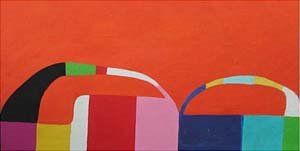
The images included here cover the majority of work in this splendid show. The image at the top is a more abstract piece (36 x 40"). Seven others are shown below. The gallery is located in San Francisco’s Mission District. Call (415) 282-4248 for the address and viewing hours.
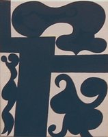
Here is one of the smaller works, 24 x 20", painted on linen rather than panel:
The following is 40 x 30":
Here's a diptych from 2005 that is 30 x 44":
The following is 40 x 30":
Below is a larger work, 40 x 36":
Below is a double-panel work, the largest, 53 x 37.5":
The following work is 40 x 30":
San Francisco Sightings — September 2006
Alert: The SFAC show closes on 10/28/06.
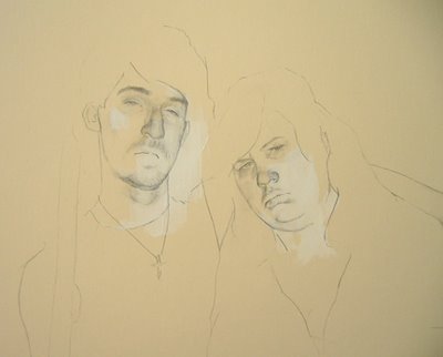
Last month, I visited the Murphy-Cadogan Fellowship show at the San Francisco Art Commission Gallery (SFAC). Among various works by local MFA candidates, several stood out. One was an overscale photo-realist painting of a camera by Edmund Wyss, which looked like artillery (image below). A colorfully nauseating video by Bessmar Khalaf showed herself devouring a confectionary landscape (next below). A polished drawing by Robert Burden depicted goofy cartoon characters, like escapees from a lowbrow TV ad, encountering trouble in a more realistic comics universe (image at top).
At the new Eleanor Harwood Gallery, there were many drawings on brown paper by Emily Prince, depicting sets of household objects. An assortment of electrical chargers was one of my favorites:
At Rena Bransten Gallery, a group show included several works by disabled artists, including an atmospheric sleep scene by the autistic William Tyler (detail below):
Three Shows Closing in SF
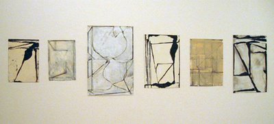
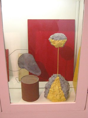
Three exhibits of interest, not previously noted here, will be closing on 11/4/06. Galerie Paule Anglim is showing drawings and sculpture by veteran San Francisco artist David Ireland (born 1930). No new territory is conquered, except perhaps in the pricing, but fans of the artist will want to take a look. In this show, I liked the small abstract drawings (photo below) and one of Ireland’s cabinets full of objects (detail above).
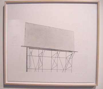
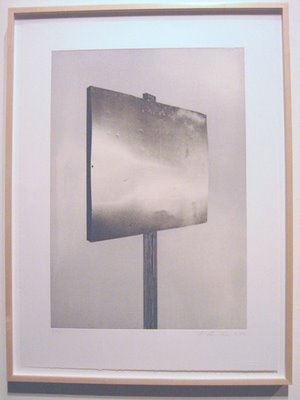
Crown Point Press has released a new series of etchings by Ed Ruscha, based on road signs. Ruscha showed up for the opening, and he’s a handsome devil still. It’s hard to believe he was born in 1937. Below are two examples from the series: a vacant billboard and—my favorite by far—a empty sign with a metallic shine.
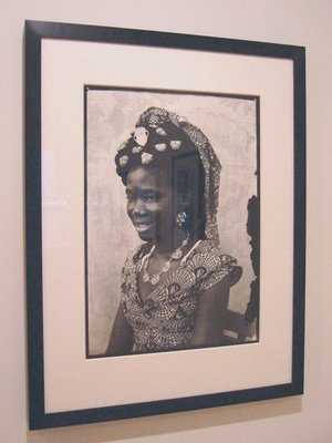
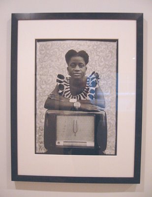
At John Berggruen, there is a show of huge photographic prints from the estate of Seydou Keïta, who lived from 1923 (approximately) to 2001 in Bamako, Mali. Portraits he made in the 1950s and 1960s gained him fame in the 1990s. Staged with backdrops, these employ a vibrant layering of patterns and sometimes include objects like radios to celebrate the everyday modernity into which the sitters had moved, often from the hinterlands. Two examples from the current exhibit are shown below. The promotion of Keïta’s work in the West has raised issues about the artist’s intent and the authenticity of some prints. For an overview of the controversy, read the article by Michael Rips, “Who Owns Seydou Keïta?,” published in the New York Times on 1/22/06. The prints in the Berggruen show are from the Sean Kelly Gallery in New York, which represents the Keïta estate in the U.S.
Monday, October 23, 2006
“Cosmic Wonder” at YBCA (SF)
Alert: This exhibit is scheduled to close on 11/5/06.
If you’d like to watch a person grope for words, just ask me to summarize the visual arts program at Yerba Buena Center for the Arts. Various descriptions come to mind: wobbly, shape-shifting, opportunistic, "multi-cultural," hipster, etc. But in truth I don’t know how to account for the record of visual art choices at this non-profit space. A defining characteristic is the huge variation in quality from show to show, and from artist to artist in group shows.
Currently on view is an exhibit curated by guest curator Betty Nguyen under the title, “Cosmic Wonder.” It’s a sprawling affair that includes video, sculpture, drawing, painting, and installations (some huge). For me, too much of the work is low-impact. Partly this may be due to YBCA’s eternal curse, an awkward architectural space. Partly it is the choice of work. A couple of artists who can be thrilling—Banks Violette and Terence Koh—are lackluster here.
Given the exhibition concept, there is a share of trippy work, and it’s among the best on view. In this show and others elsewhere, a number of young artists have revived the trippy aesthetic while avoiding the scrapbook moldiness of the Sixties. (A few older artists have remained nimble with this aesthetic all the while. Think of Lucas Samaras.)
In this show I like the small black-and-white drawings by the senior participant, Yayoi Kusama (born 1929). However, a better choice would have been some of this artist’s large color work, or an installation.
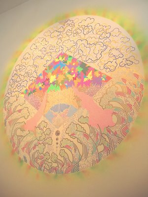
An effective scale is achieved in Hisham Bharoocha’s exuberant wall drawing, which dominates one side of the main space. I managed to snap a bad photo while the guard wasn’t looking:
The show’s most engaging works are abstracted videos. One is a video kaleidoscope by Ara Peterson, Jim Drain, and Eamon Brown. Installed in a wall at viewer height, you find a triangular shaft lined with mirror surfaces leading to a video screen at the end of the shaft. Shifting patterns on the screen are refracted into a geodesic globe shape. Eyes pop and jaws drop. Viewers experience involuntary physical reactions.
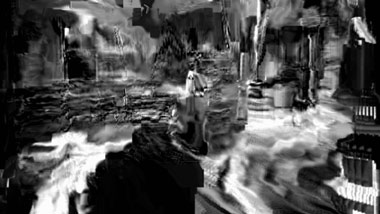
The most memorable work is Takeshi Murata’s video, “Untitled (Silver),” which I have previously viewed at Ratio 3 in San Francisco. This is a projected black-and-white video in which a 10-minute segment from an Italian horror movie has been subjected to massive digital distortion and overlaid with a droning score by Robert Beatty and Ellen Mollé. The longer you watch, the more it gets under your skin. Fleeting bits of it will become lodged in your permanent memory bank. An image of this work (from the Gladstone Gallery website) is provided at the top.
Sadly, the YBCA website offers little information about this exhibit, visual or otherwise. The same is true for prior exhibitions in their so-called archive. This is a disservice to the artists, the curators, and the public.
Sunday, October 22, 2006
Andrew Masullo at Paule Anglim (SF)
Last August, Galerie Paule Anglim presented an exhibit of paintings by mid-career artist Andrew Masullo, who currently lives in San Francisco (and previously in New York). Working in oil on canvas, Masullo seems to aim for pleasure rather than self-importance. He uses small formats. In this show, sizes were 8x10" at the low end and 14x18", 10x20", and 16x20" for some of the best pieces. The colors are cheery. In a 2003 review in Art in America, Michael Duncan was spot-on in describing them as “associated with hard candy or Fisher-Price toys.” The shapes look like goofy versions of modern graphical design.
In today's leading art venues, a good deal of work on view is conceptual, political, ironic, referential, transcendental—in other words, a bit of a workout. Sometimes it wants to grab you by the collar with its keen message, or dazzle you with size or superhuman technique. Masullo is more intimate and approachable. His paintings refresh the taste buds between courses of heavier art, like sorbet.
The strength of these paintings is precisely their focus on the pleasures of color, composition, and abstract forms. That is all they need. In some of the work, an interesting use of underpainting reinforces the viewer’s awareness that the work is not naïve. In fact, this work is most fully appreciated in a multi-generational context among artists such as Paul Feeley, Myron Stout, Thomas Nozkowski, Chris Martin, and Chuck Webster.
Examples of work in the August show are shown above and below. The first three images are taken from the gallery website. The final shot, taken by me, shows the artist working without bright colors.
Friday, October 20, 2006
The Arts in California's Future
Last month, the James Irvine Foundation issued a working paper entitled, “Critical Issues Facing the Arts in California.” This study is step one in a project designed to examine “the forces, trends, and challenges facing California’s arts sector today.” The project is potentially a turning point for the arts in California. The foundation is seeking public comment via a website, where a copy of the working paper can be downloaded. The deadline for comments is 10/31/06.
The working paper is crammed with statistics of interest, and it highlights a number of significant social, economic, and political factors that affect the arts. The focus is on the situation of non-profit arts organizations.
While there is much to praise in this document, there are certain aspects that leave me uneasy. A few points that trouble me:
1. The report uses the word “consumer” to describe a person interested in the arts. This signals the intrusion of a market mentality that is evident in much of the report’s discussions. The notions of “art lover” and “citizen” do not appear. The consumer lingo misconceives the role that the arts actually play in people’s lives. It neglects the spiritual and social impulses that are at the core of the art experience.
2. Similarly, the report makes repeated reference to the arts world as a “sector.” This is denatured at best, and at worst it turns the arts into just another worry point in an industrial economy, like the automobile industry or the upsurge in hedge funds. Any human activity has an economic dimension but that doesn’t mean that the economic lens is the best way to view every one of them.
3. The report’s economic slant on the arts seems like a strategy to avoid discussion of the non-economic functions of the arts, which would move into sticky areas such as “purpose” and “meaning” and “value.” The report tries to be agnostic about the very qualities that lure people into the arts. Sometimes the attempt to be hard-headed results in a failure be clear-headed. I don’t believe that the project can grasp the situation clearly if the core values of the arts are not articulated.
4. The report shows a lamentable sense of passivity toward the social and economic forces that impinge on the arts. The arts world is pictured to be on the run from market-oriented gorgons that thunder through the land. Survival is sought through imitation, in a variant of the Stockholm Syndrome. This discounts the strength of the arts and of arts advocates.
5. The report says nothing about aesthetic standards. No doubt this is another instance of avoiding a sticky wicket. I believe on the contrary that the all fundamental issues need to be discussed in order to achieve success. The prudery that has developed around certain topics, a legacy of Sixties politics, needs to be overcome.
6. It may seem like a minor point, but the report says nothing about the role of critics in the arts. I think history has shown that independent criticism is valuable as a record of events and even more as a spur to interest and discussion. The presence and quality of arts criticism is uneven across California and in some instances quite poor.
Group Show at Rena Bransten (SF)
The title of the new group show at Rena Bransten Gallery is “On the Road Again: Beat Culture, Bush Era.” I have no idea what this means. If you saw the show without knowing the title and then were asked to pick a suitable title from dozens of possibilities, I doubt you'd pick this one. A more relevant banner would have been “Boy Band,” for there is nary a woman in this show.
It’s a good show, though. There is a lot of drawing but also sculpture, collage, and film. Nearly all the artists are based in San Francisco.
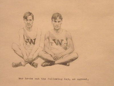
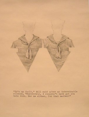
Colter Jacobsen contributes a group of small graphite drawings in which he extracts imagery from a friend’s postcard collection and presents it with words from another friend (typewritten). Here are two examples, which also reflect the artist’s long-standing interest in pairings:
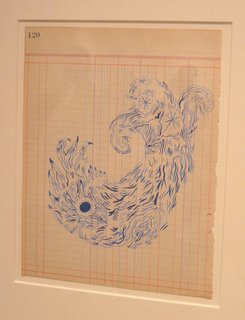
The well-known singer Devendra Banhart has two small drawings in the show. Here is one:
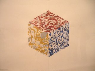
Oliver Halsman Rosenberg contributes several medium-sized drawings. In one of them, perhaps my favorite, a cube in muted primary colors takes on a mandala effect as it dematerializes and changes perspective:
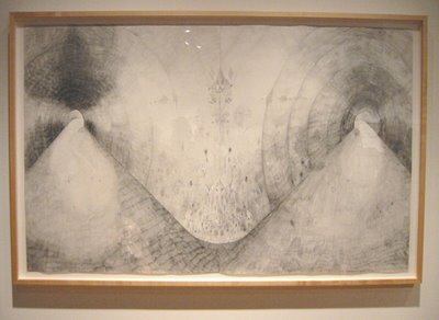
On a larger scale, Jay Nelson offers three imaginary landscapes in graphite. The largest of these (about 41 x 63 inches) depicts two tunnels coming together. There are delicate details that might be markings on the tunnel walls or hieroglyphic leakage from another plane of reality. The work is splendid but hard to photograph. Here is my attempt:
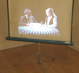
The remaining flat works—by Erik Frydenborg and Geof Oppenheimer—employ drawing and collage. The sole film work is by Oppenheimer. Opening night chatter overwhelmed the audio of this piece. The film was projected on a portable screen by a looping projector whose elaborate threading mechanism may have been more compelling than the film. Here’s a shot of the screen:
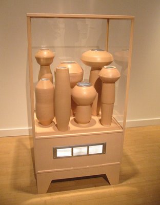
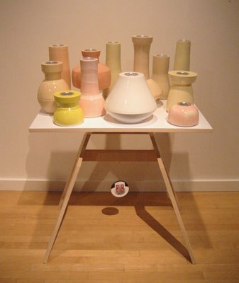
Rounding out the show are three floor-standing sculptures by Ian McDonald. Two of these employ his signature ceramic vessels known as “breathers,” which have tiny metal vents in their tops. In one case, the breathers resemble a cluster of aliens waiting in a decompression chamber, or maybe a decontamination chamber (photo at top). An intriguing work, and an early sale.
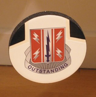
In the other case, the breathers are presented as chic objects on a crisp table, under which dangles another signature device, a ceramic decal based on military insignia.
A good deal of McDonald’s work addresses symbols of personal identity, including identities claimed through the deployment of Modernist objects. The decal for the above piece is forthright about the social cachet these symbols are designed to create (see close-up below).
Wednesday, October 11, 2006
East Bay Sightings — August 2006
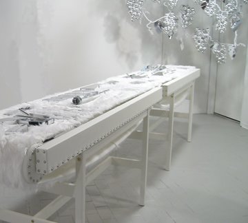
On visits to the East Bay in August, I came across some interesting work at both Kala Art Institute and Ego Park. At Kala, in Berkeley, a group show included Taro Hattori’s installation “Beaut Brute II.” Using consumer fetish aesthetics, the work featured machine gun components fashioned from mirrored plastic. These were neatly arrayed on a conveyor belt of fake white fur. The support structure was covered in white vinyl leather, and a silvery grape arbor hung in the background. The grapes were included, according to the artist, as a symbol of nature, sexuality, and the sacred. This work (photos at top and below) was later shown at The LAB, as noted in a previous post.
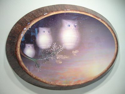
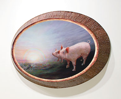
Also at Kala were several of Daniel Ross’s creepy variations on the type of souvenir for which a pretty nature scene is laminated onto a slice of tree (with bark). Ross’s versions are several feet across and half-a-foot thick. They combine digital printing, sculpture, painting, and varnish. The “noise” generated by the digital process is used to painterly effect. Ross ramps-up the sentimental aesthetic while incorporating spooky animal figures. One example included hovering white owls (photo below). Another depicted a pig head growing out of a pig head (second photo below, taken from the Kala website).
Over in Oakland, one of the most interesting galleries now is Ego Park. The regular hours are pitifully limited—can’t they find some interns? But you can call to set up an appointment more or less at your convenience. I happened to visit without appointment on a day the gallery was closed. A sizable group show beckoned from within. A neighbor-with-key with authorized by phone to let me in, but neither of us could find the light switches. Even in semi-darkness, I enjoyed many works in this show, more than I can mention here.
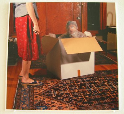
Ben Riesman offered one of his inventive large-format photos (that’s him in the box):
Another large photo, by Sophie Maher, captured the formal beauty of an ominous structure:
Finally, Matt Momchilov showed his drawing chops in works that brought to mind the German Expressionists:
David O. Johnson, Summer 2006
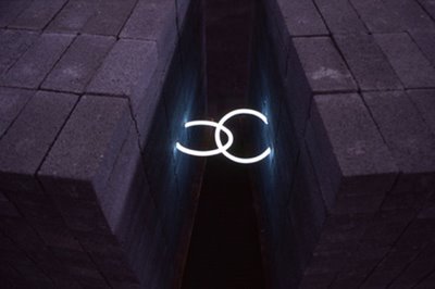
David O. Johnson is a young San Francisco sculptor who’s an expert in neon, which he embeds in concrete, sheetrock, styrofoam, etc. He has stated that he's interested in the contrast of materials. Viewers with a metaphorical bent may also see spiritual meaning in these constructions of light emerging from drab industrial materials.
I first became aware of Johnson’s work at the 2004 SFAI MFA exhibit. I noticed a piece in which two large masses were linked by neon loops. The image above, taken from the artist's website, shows a detail of this work (or a variant of it).
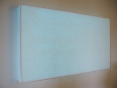
My next encounter was in June this year when I visited (and blogged about) a group show at Root Division. One of Johnson’s works in that show was a glowing box made of styrofoam sheets (image below).
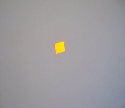
Another work in that sprawling show was an installation that created a tiny bright splash of orange-yellow light, roughly square or diamond shaped, casually off-kilter, on an otherwise vacant wall. It took awhile to notice it was there. At a distance, it looked like a superbright projection. Close up, it was clearly something else, but what? It turned out to be reflected neon light behind a hole in the wall. The hole had been tapered from the reverse side to create ultra-thin edges. The glow came indirectly from a fixture out of sight. The light had a viscous quality that was as magical as it is hard to describe. Photographing this work was beyond my skill, but I did make an effort (below).
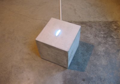
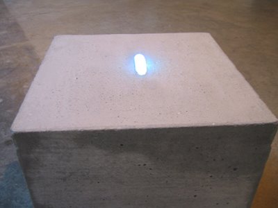
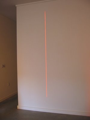
Then in July, the Ping Pong Gallery gave Johnson a solo exhibit. This included a glowing vertical slit in one wall and a small concrete cube, both captivating (images below). I look forward to more work from this artist.
Tuesday, October 10, 2006
Joshua Pieper at Blankspace (Oakland)
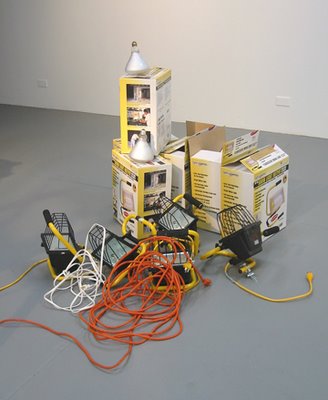
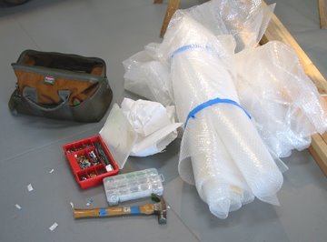
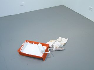
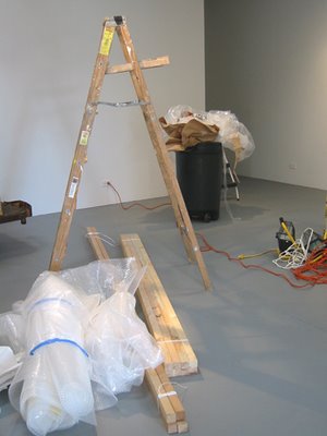
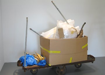
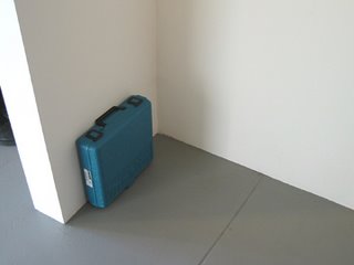
Joshua Pieper’s drawings, sculpture, and video have cropped up in a number of Bay Area shows, including one that I co-curated at Mission 17. He has established a quirky artistic personality inclined to deadpan wit. When the experimental Oakland gallery Blankspace gave him the run of the place last July, I showed up early for the opening. The show threw me for a loop. The main space was crowded with industrious disarray, mimicking what you might see in a closed gallery during an installation period. Tools and equipment were everywhere. The only conventional art was a few photographs on the wall. But they were photos of the sorts of things that filled the gallery.
It is as if Pieper had looked at Louise Lawler’s photos—which document artworks in storage, in transit, in the process of installation or de-installation—and decided he could go further. The results were compelling in a number of ways. Ideas about public and private, about the inelegant backstages of a world that craves slick presentations, came to the fore. The displayed paraphernalia invited you to view it as sculpture, and deny it. The placement of the objects, accomplished with intent but without an over-mindful design, provided a bit of Zen intrigue. And of course there was the exhilaration of the sheer impudence.
Photos (above and below) provide some views of the exhibit.
Subscribe to:
Posts (Atom)